Our detailed guide
How to Build Accurate & Live Facebook Ads Dashboards with Looker Studio (Formerly Google Data Studio)
Last updated: September 19th, 2023

Trey Edwards
Digital Marketing Strategist
Easily create completely custom visual dashboards & reports on Looker Studio using data from your Facebook Ads accounts.
Do you want to build accurate Facebook Ad dashboards that update automatically and allow you to send reports with detailed and interactive charts and graphs?
Looker Studio (Formerly Google Data Studio) is a great tool for this.You can completely automate your ad reporting into a completely customizable dashboard that can be shared with others and is updated live. You’ll have the ability to create beautiful reports that show performance over time and can be interacted with live.
I first started using Data Studio (now Looker Studio) back when the dreaded IOS14 update came out and wrecked my Facebook conversion tracking. With Data Studio, I could add other sources of data (like Google Analytics) to my dashboards that tracked conversions more accurately.
The Facebook Ads Manager isn’t the best reporting tool.It’s slow, clunky, buggy, and just downright frustrating at times. It can be very difficult to let clients or company decision-makers have access to the metrics that they need without tossing them head-first into a very confusing system that they’ve never used before.
With Looker Studio, we can create our own dashboards from scratch using the raw data from Facebook, which will update live using an app called SyncWith. We can use any of the data that we would normally find in the Facebook Ads Manager, and present it in whatever way is most useful to the people that will be reading our reports. We can completely customize the order, structure, visuals, and even use custom formulas to calculate entirely new metrics.
Let’s start by getting Facebook connected.
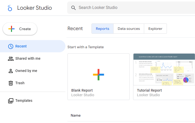
First, go to lookerstudio.google.com and click the Blank Reporticon.
Looker Studio has a lot of templates that are very helpful, and should really speed up the process for you once you know how to use the app.
However, those won’t help you much if you don’t know how to connect your data sources and create/edit your graphs and charts, which is what we will be covering today.
When you first create a new dashboard (called Reports in Looker Studio), you’ll be prompted to connect to a data source:
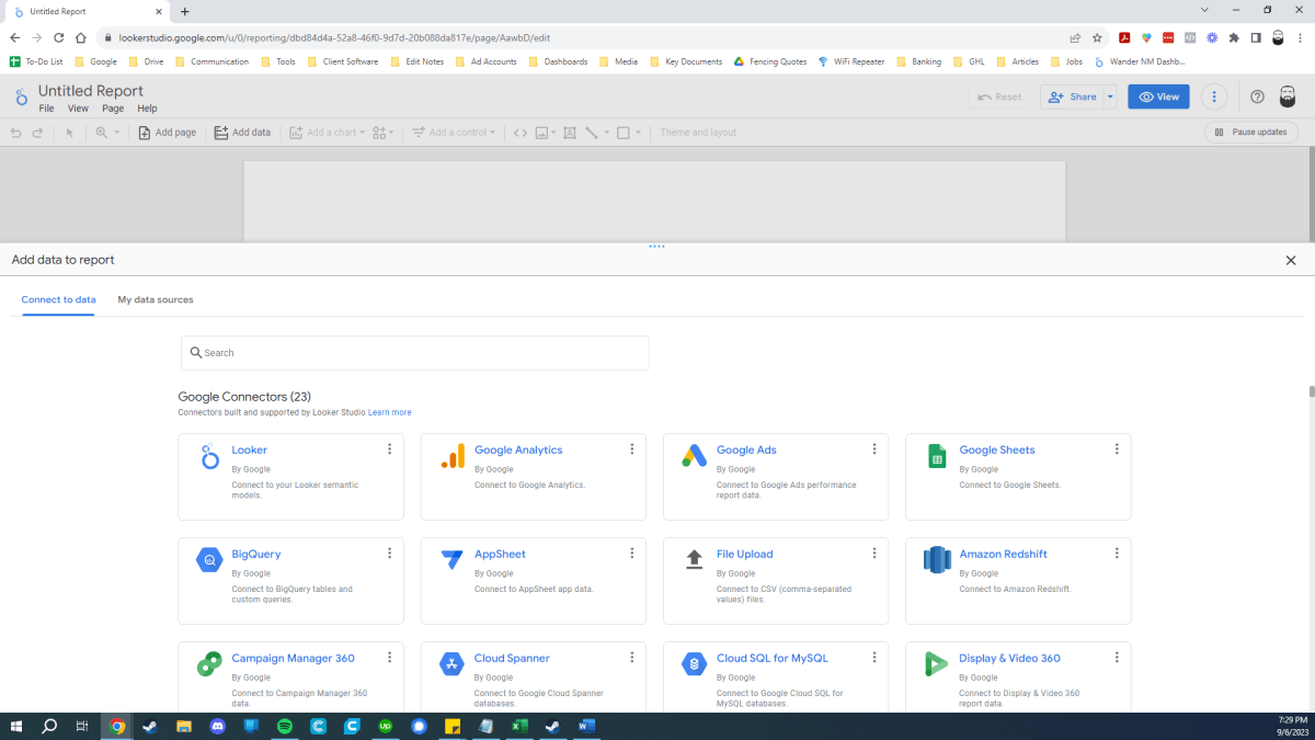
There is no native Facebook Ad connector. I’ve tried numerous different plug-ins, and the only one that has ever worked the way I needed it to is SyncWith, so that is the one we will be using today.
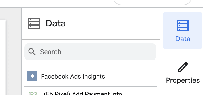
Simply type SyncWith into the search bar. You’ll want to use the Facebook Ad Insights one that should appear on the top left.
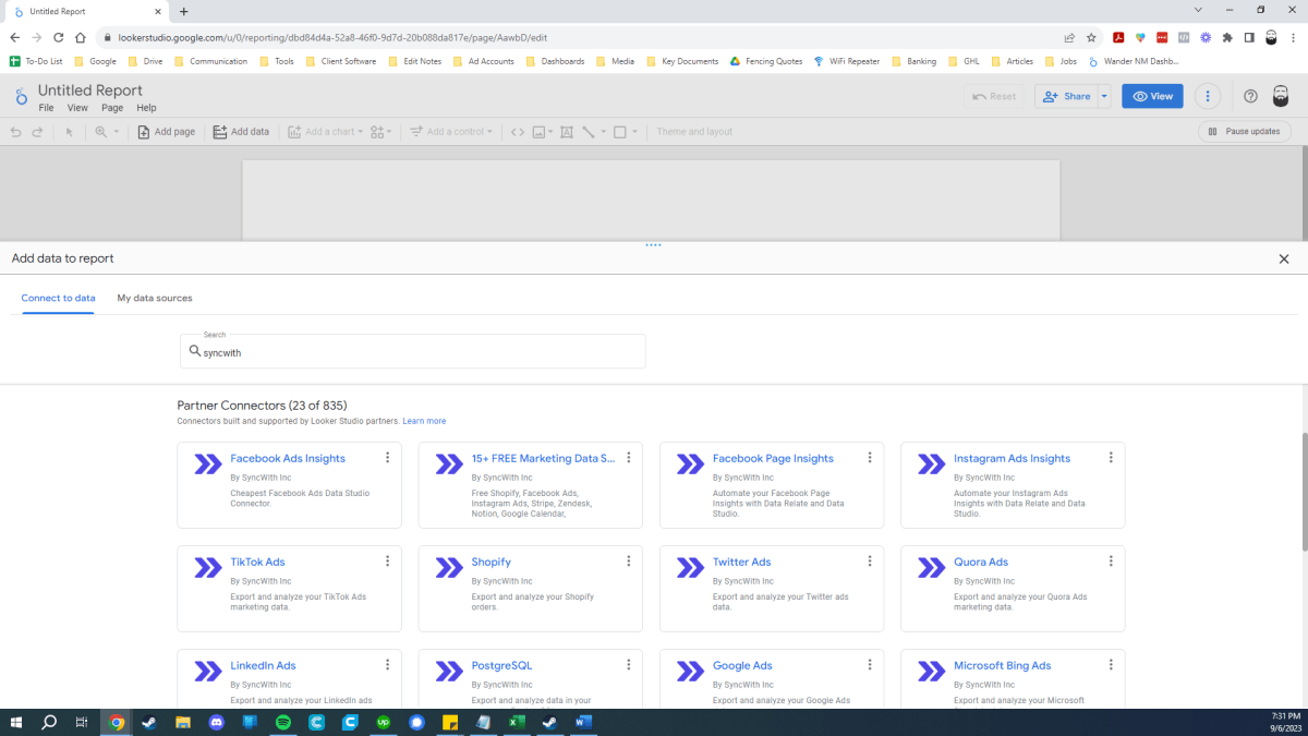
Note: SyncWith has a lot of different connectors. Once you have a SyncWith account, you should explore their other connectors and mix in additional data sources for truly epic dashboards!
Next, you’ll want to set up a SyncWith account. After selecting theFacebook Ads Insights option, you should be taken to this screen, where you’ll need to click the blue Authorize button.
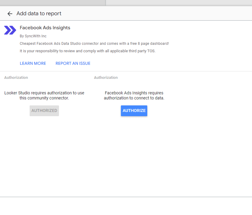
The SyncWith app will need to be authorized three times - twice for your Google account and once for your Facebook account.
Once you’ve logged into your Facebook account to authorize the app, you’ll choose which pages you want to use, or if you want the app to be able to access all of your pages now and in the future:
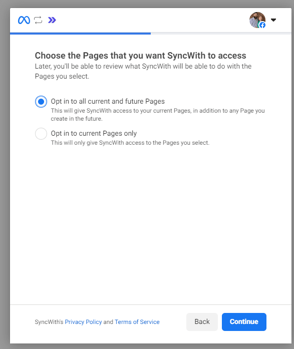
I would recommend setting it up to connect to all current and future accounts.You will select the page or ad account that you want to use each time you set up a new report, so there won’t be any data shared that you don’t share with that report specifically.
In other words, you don’t have to worry about data from one client ending up on another client’s report.
Note: You can add data from multiple accounts to a single report by selecting Allow Ad Accounts to be modified in reports.
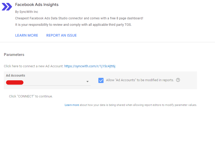
Once this is done, you can change the ad account for any chart by scrolling to the bottom of the right sidebar and selecting the account from the Parameters section.
That will allow you to add charts to your dashboard that each connect to different accounts.
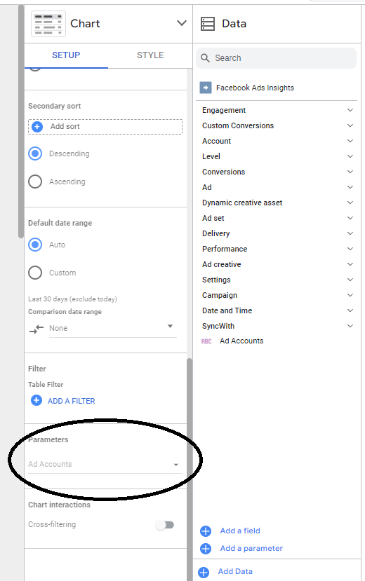
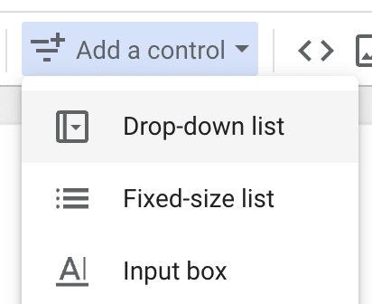
If you’d like to set up a dashboard to where you can change ALL of the charts from one account to another, you can do so by adding a control drop-down menu to the page.
To do this, click Add a control from your top menu bar, then selectDrop-down list. In the “control field” property, type in Ad Accounts.

This will allow you to switch accounts for an entire page at once. When you select an account, ALL charts, graphs, etc will update accordingly unless you have specifically programmed them otherwise.
Once you complete this process, you’ll be redirected to a SyncWith configuration selection screen:
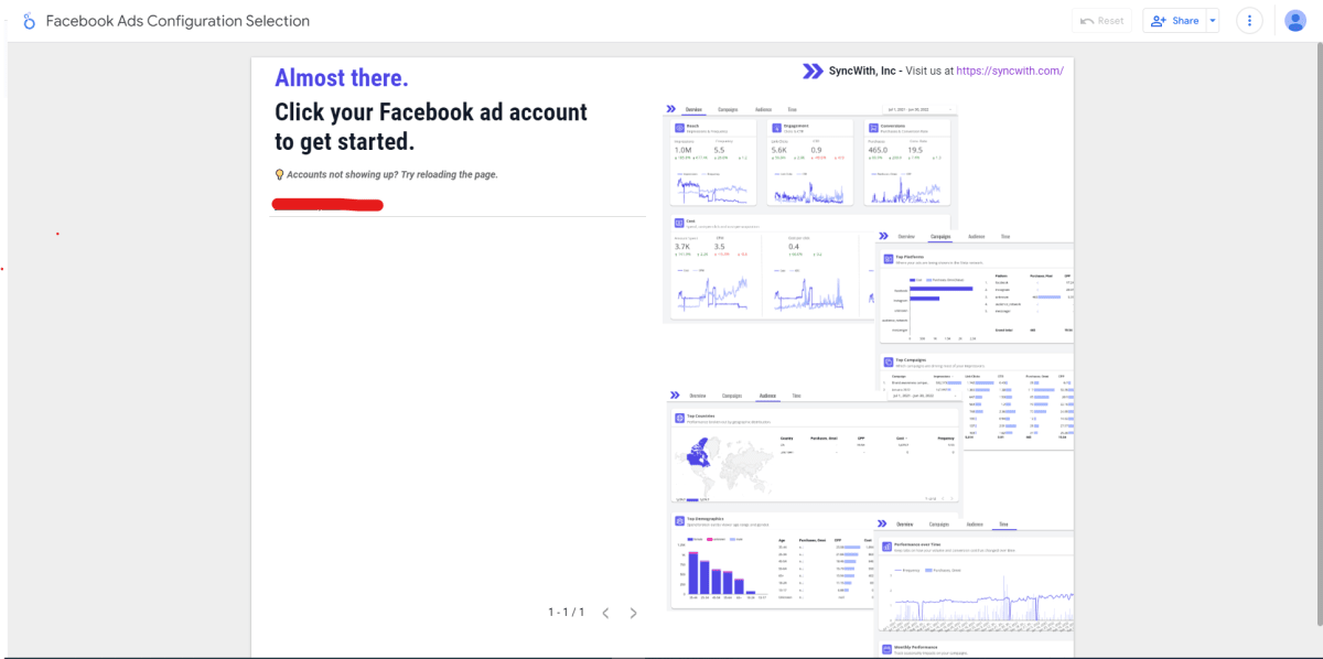
Select the account you want to use, and SyncWith will create a template dashboard. Don’t worry - you don’t have to use this dashboard if you don’t want to. It’s just there in case you need an extra boost.
For this tutorial, we’re working on our blank canvas. Go ahead and close that template report for now, go back to the tab where you started a new dashboard, and refresh the page.
You’ll need to repeat the process to add SyncWith to your new dashboard, but this time you won’t have to set anything up. Just click the
Facebook Ad Insights option on the search screen and this time you’ll be able to select the ad account that you’d like to use for this report:
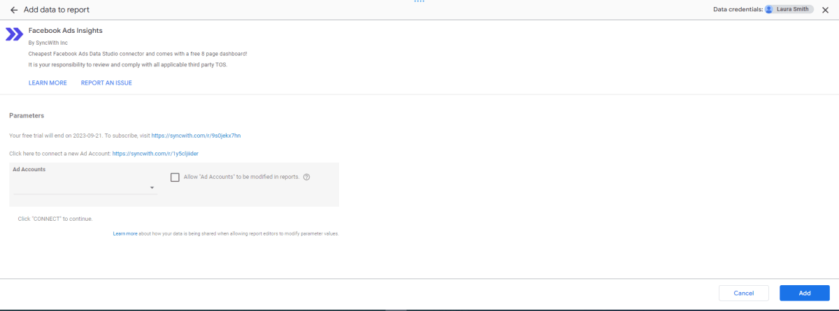
Note: SyncWith’s Looker Studio plugin comes with a free 14-day trial, with no limits on the functionality. There is a monthly fee for the app, but it is easily paid for in the time you save by never having to do another manual report! Additionally, you will get access to ALL of SyncWith’s plugins with this subscription. Automations galore!
Now, select the ad account that you’d like to use, and hit the big blue Add button.
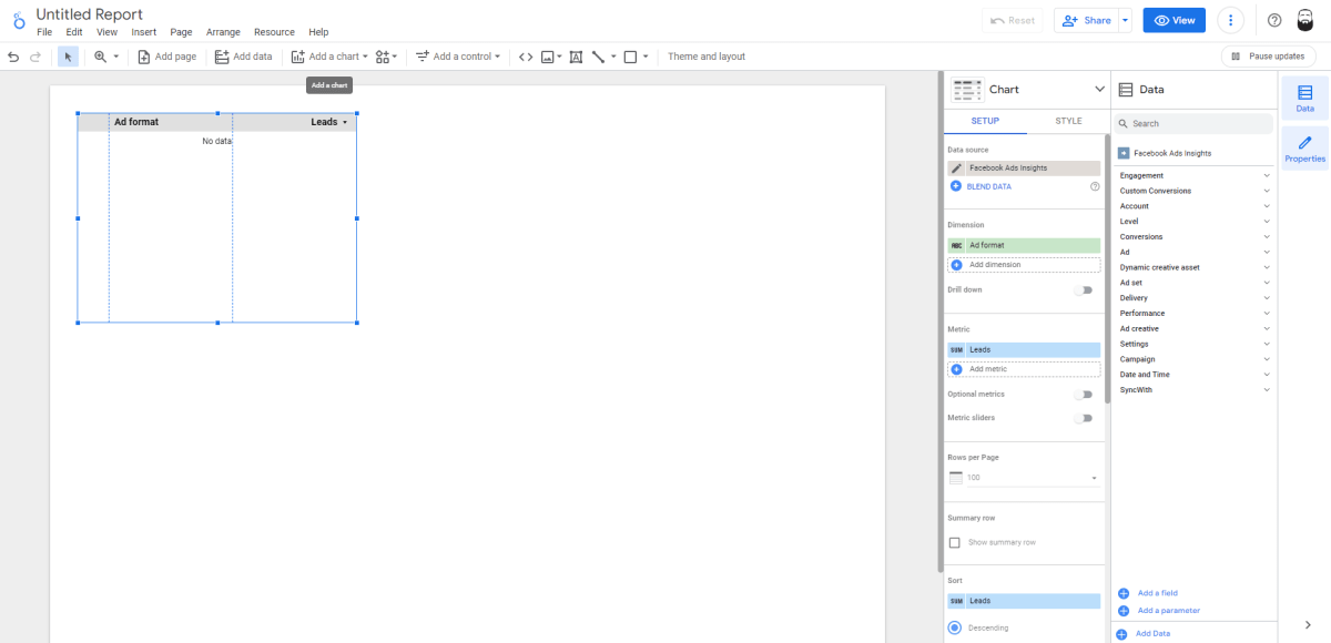
Looker Studio will automatically add a chart to the canvas - you can start by editing this chart, or you can delete it. We’ll use it.
When your account is first connected and the dashboard is first created, it should look something like this:
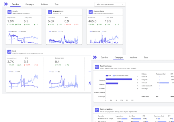
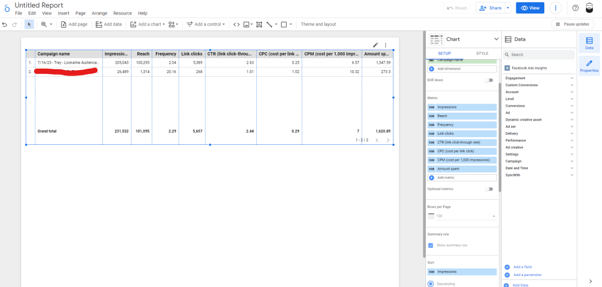
We’re going to start by creating something I always find extremely helpful for my clients - a better version of the Facebook Ad Manager’s main screen.
Most people that I try to show around the Facebook Ads Manager are instantly confused by the Campaign > Ad Set > Ad structure. They aren’t sure what the difference is and they aren’t sure how to tell what level they are currently at. We’re going to fix that for them.
On the slide-out panel on the right side of your screen, change whateverDimension variable was automatically selected, and change it to Campaign Name.
Your campaigns should appear on the chart.

Next, use the Metric section to add the metrics that you would like on your dashboard. We’ll start by adding some of the basics: Impressions, Reach, Frequency, Link Clicks, CTR, CPC, CPM, and Amount Spent. Expand your chart on the canvas to touch the sides, and double-click any of the vertical lines between your metrics to auto-size all of your columns.
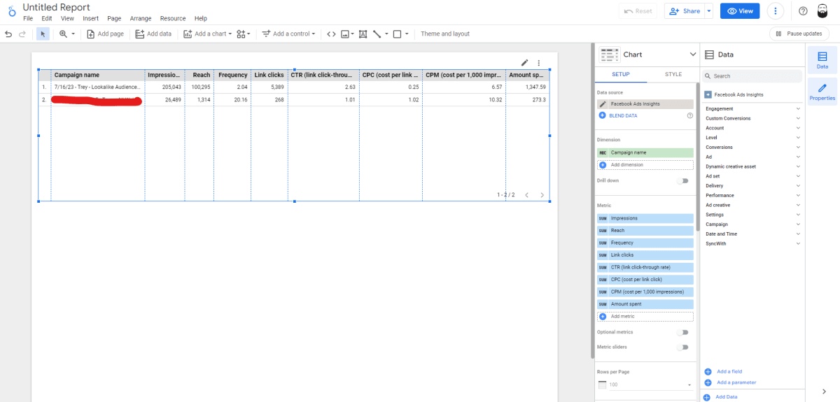
I like to scroll down on the Setup bar and selectShow Summary Row for all of my charts. That final touch is all you need to finish this chart:
With your chart still selected, type CTRL+C and then CTRL+V (or whatever hotkey you Mac people use to copy and paste), and a duplicated version of your chart will appear. Adjust them for position and size, and change the Dimension on the bottom chart toAdset Name.
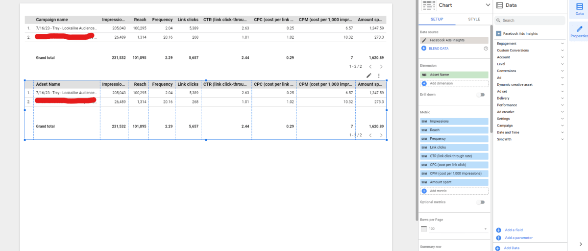
Repeat this process again, changing the Dimension toAd Name.

Finally, click the Add a control menu item on the top bar, and select Date Range Control.
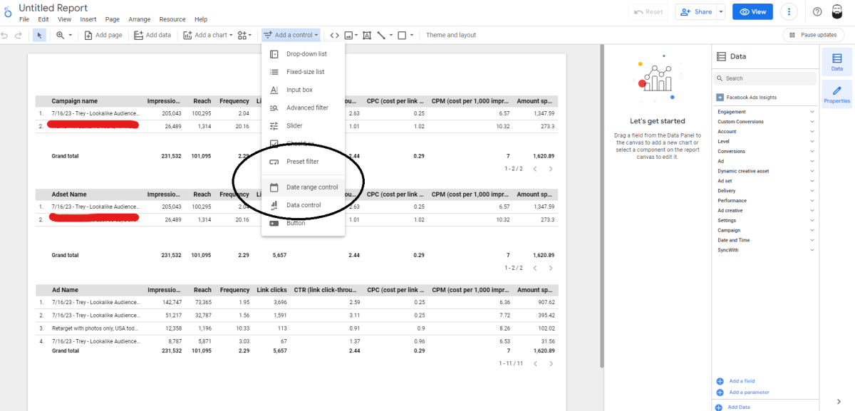
Drag the date range controller wherever you’d like it. I prefer the top right corner, since that is where the date control menu is located on the Facebook Ads Manager. You can leave this controller with the default settings, or you can set it to automatically display a certain time period (relative or fixed). I usually like to use the Last 7 Days option.

Now, step back and look at what you’ve accomplished!
In less than 15 minutes, you built a better ads reporting dashboard than Facebook. Congrats! Pat yourself on the back.
Instead of being a confusing tiered system where a non-marketing-expert can easily struggle to figure out what they are looking at, you’ve instead broken down your advertising campaigns into a very logical and easy to understand manner. Anyone can easily see the metrics at all three levels and see what is running.
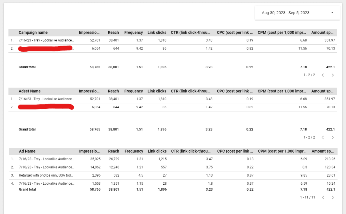
The date control on the top right can be used to change what period of time you are viewing statistics for. You can easily add or remove any metrics that you’d like from these charts and share the View version of your dashboard with anyone who wants to use it but doesn’t need edit access.
Next, we’re going to create some basic graphs.
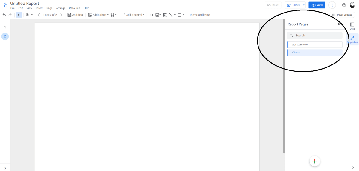
Let’s create a new page for our document. Looker Studio can get a bit laggy if there are too many elements on one page. There isn’t nearly enough on our current page to slow it down but we will use a new page anyway for this tutorial’s purpose.
Click the Add page button on the top menu bar.

This will open up a new sidebar that shows the pages on your document. You can use this sidebar to rename, reorganize, or delete your pages. This is a great way to organize your information and keep it all easy to understand. We’ll name our pages and then add some charts.
The Facebook Ads Manager does a good job of giving you all of the raw data, but it is horrible at visualizing the data over time. Looker Studio solves this problem and can be used to create pretty much any chart you can possibly imagine.
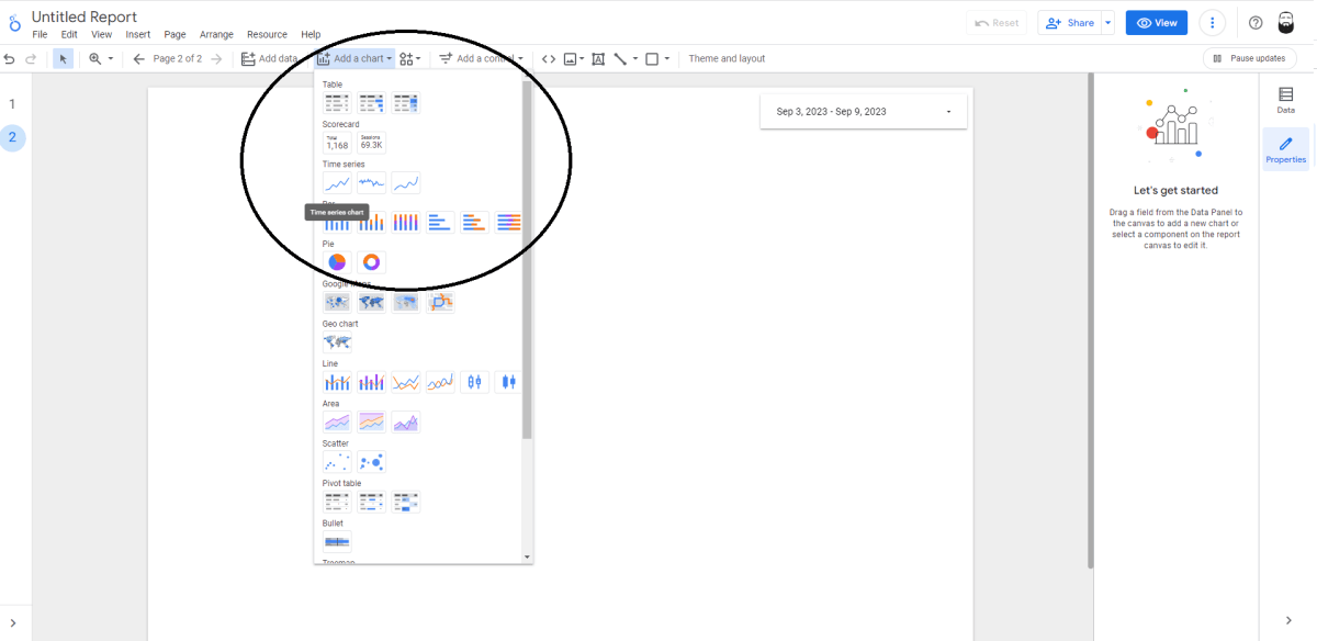
Let’s create some charts of our key stats from the first page. Refer to the instructions above on adding a time control bar to the top of the page, then click the Add a chart dropdown on the top menu and select the Time Series option.
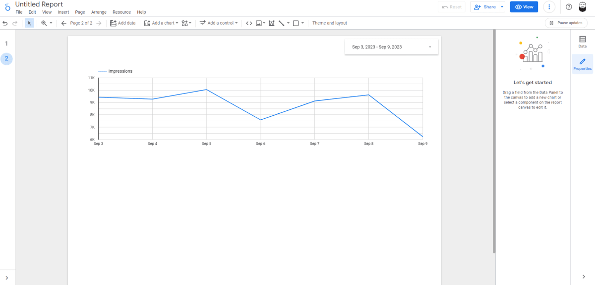
We’ll use the first stat from our charts above - impressions.
On the chart that you just created, use the sidebar setup menu to change your Dimension to Day. Then choose Impressions as your metric.
The result should look like this:
You can change the dimensions and metrics to fit your campaign’s objectives, content, and campaign structure. You can show leads, purchases, revenue, clicks, or any other metric available in the Facebook Ads Manager. If you have custom conversion events set up, those should appear as well (although you may need to refresh the SyncWith connection if you create new ones)
After adding a few more graphs, you will notice that you’ll run out of space at the bottom of your document. If you want to keep all of our graphs on one page, just use the top menu to change the dimensions of your document. Click Page and Current page settings, navigate to the Style section of the sidebar menu, and change your height and/or width:

This will change the size of the specific page that you are on. It will not affect the other pages.
You have a lot of control over the options on these charts. You can create scorecards, bar charts, pie charts, show locations on Google Maps, mix line and bar charts, area charts, scatter boards, pivot tables, and much more! You can use these options to create pretty much anything you can imagine.

Each of these charts has a lot of customization options, as well. You can use the Style section that we just showed you on each of these graphs and charts to change the look to match your company branding or just create visually appealing dashboards!
Reporting on multiple ad accounts
If you’re managing campaigns across multiple clients (or multiple ad accounts) you can also easily setup a dashboard in Looker Studio to report on multiple Facebook ad accounts with these steps:
First, make sure you’ve configured the Looker Studio report to be able to modify the ad account(s) within the report. You can do this when initially setting up a report. If you’ve already create a report then you can enable this easily by clicking Edit data source
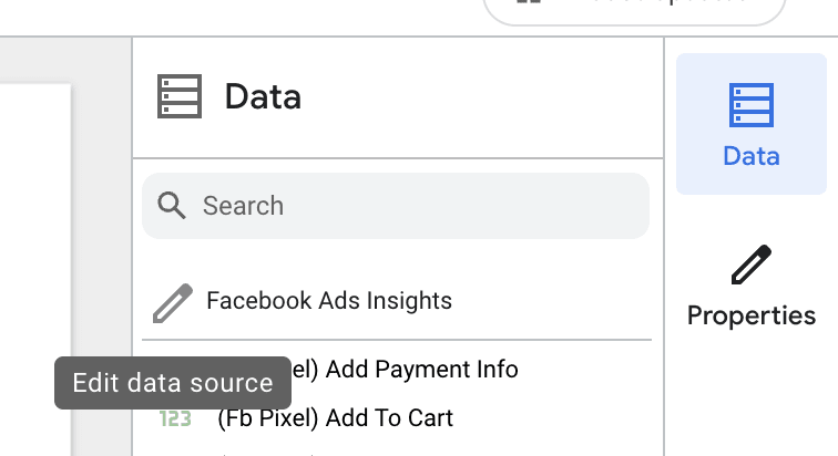
When editing the data source chooseAllow Ad accounts to be modified in reports

Next click Add a control and choose typeDrop-down list
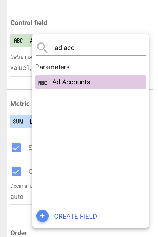
Then configure the control to set the Control Field to the purple one named Ad accounts
Now you should be able to use the dropdown control to select multiple a d accounts and the report will report on all of them at once.

In Conclusion
There is virtually no limit to what you can create with Looker Studio. Think of it as the ultimate whiteboard app - and it’s completely free! You do have to pay for some of the third-party add-ons like SyncWith, but the core Looker Studio app is completely free. You can use other Google data sources (like Sheets) for free, and you can use SyncWith to bring in data from outside apps like TikTok, Shopify, Stripe, Pinterest, Microsoft (Bing) Ads, SnapChat, Quora, PayPal, Amazon Seller, SEMRush, SEOMoz, Ahrefs, Monday, Asana, Trello, Github, Quickbooks, Xero, Zoho Books, and thousands of other sources!
That covers the basics of creating reports on Looker Studio with your Facebook Ads data. There is so much more we could go over, but we can’t cover everything in this one tutorial.
What would you like to see us cover in our next tutorial?